Welcome to Key & Heal. The site is currently in Beta. Join our healer community on Discord and share your suggestions. You can also use the contact form.
Table of Contents
Grid 2
Grid 2 is a unit frame add-on. It provides a way to replace Blizzard default unit frames and provide much more customization. While it can take some time to setup frames to your taste, it is a very important part of playing in the healer role as protecting health and status of your allies is your job. Grid 2 does a pretty good job of being accessible while providing mountains of customization options.
Don't hesitate to check out Madskillzz Videos if you prefer a video guide!
Recipes
How to track a new debuff
How to add a Boss or Trash to a Dungeon in Raid Debuffs
How to display raid debuffs as a list of icons
How to create a complete health bar (heal absorbs included)
How to create a list of important debuffs
How to track a new buff
How to create a group of icons for players' defensives
How to track two buffs with the same name (Echo)
How to display Private Auras on your frames
General Guide
Grid 2 neatly separates what you want to show on your unit frames and how you want to show it. What you want to show is under statuses, this will include buffs, debuffs, health level, various status such as dead, offline, feign death etc. How you want to show them is under indicators. Here you will find the elements that Grid2 can create on your unit frames.
The process is generally simple, say you want to display a HOT such as Renewing Mists on your frames:
- you will need to add Renewing Mist as a status Grid2 should track.
- Then you will create an indicator such as an icon on the top left of the frames.
- The last step is tell Grid2 to track your Renewing Mist status with this indicator.
We will go through all the possibilities Grid2 offers in terms of what it can track and how it can display, before reviewing the general configuration options
Select what to track - Statuses
The first thing that comes to mind are buffs (your heal over time, externals, the player defensives) and debuffs (Damage over time on your allies, slows, poisons etc) and that's what you will spend most of your time with. However Grid2 goes further and can modify how to display Raid icons, Health, Absorbs, Player Class and many more, basically any information that represent the current state of a player. Fortunately, Grid2 provides a default configuration that is sufficient for most cases, so that we can focus on buffs and debuffs at first.
In general a status will be defined by well, what it is, but also one or more colors that indicators will be able to use to determine which color the frame border should be when displaying this status for example.
Buffs
Buffs mostly represent beneficial effects that are applied by you or your allies, as well as some environmental buffs that are mostly irrelevant to your dungeon gameplay (temporary experience bonus, timewalking week etc). The most obvious example are your heal over time effects like Rejuvenation but it also includes temporary bonus like Rallying Cry. Grid2 will already have some buffs configured by default for your class, but you will be able to add many more!
Create a Buff
We have a recipe to help you out here: How to track a new buff. You will start by heading to the Buffs Section Screen, select Buff as the type of status you want to create and enter the Spell Name or the Spell ID you would like to track. Sometimes, Grid2 will be able to find the Buff with the Spell Name, sometimes you might need to use the Spell ID. The only thing left is to tell Grid2 if you only want the buffs created by you, by your teammates, or both. For your heals, you will choose to select only yours in general, for defensives, you will want to know about both, as they are of equal importance for your decision making.
You have done most of the work, now you will be able to configure the colors for your buff. If you later choose to display them as an icon it will be irrelevant. However if you want to display them as a colored square, it might be interesting to create different colors to represent the number of stacks, the remaining time or their value (shields). You can also always come back here later when you want to fine tune your display.
Create a group of Buffs
If you are okay with giving up some control on how buffs will be exactly displayed one by one, you can create a group of Buffs. For example, you could want to display all players defensives at the same location on the frame, or with the same fixed color if you wont use icons. In this case, you can head to the Buffs Section Screen, and select Buffs as the type and name as you would like. You will only be able to give a single color to your group, and a list of the buffs you want to add to the group (by Spell Name or Spell ID). This can be a huge gain of time.
Debuffs
The word debuffs can be misleading. A debuff represents a negative status self inflicted or any status applied to you by an enemy (or friendly NPC) in a dungeon. Some of them can be dispelled (Magic, Curse, Poison, Disease), some represent the application of a Mechanic (Bleed, Root, Snare, Stun, Fear), some of them both or none of it. What is invariant is that most of them matter to your decision making as a healer, and as such it is important to have a good way to be informed that they are applied to a player.
Raid Debuffs
The Raid Debuffs module is one of the key features of Grid2, and is probably why you will love the addon. It basically organizes all the debuffs by instance and boss (or trash). You will then be able to select which debuffs to enable. You can also add debuffs that are not yet tracked manually (although I have worked with the addon author michaelsp to ensure the list is complete for the dungeons of Season3). The result is that you have a very long list of debuffs all organized and sorted ready to be displayed in an icons indicator (see later in this guide). First things first, you will want to configure the module to support multiple icons, as well as activate the expansions you will need (or rely on auto-detection, but I just find activating the expansions easier)
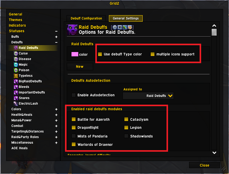
We have several recipes on how to add a Boss or a Debuff in Raid Debuffs. I would recommend always using this module when you want to add a Debuffs that's specific to an enemy. Another good funciton is that you can link a Debuff to your chat to help out other healers find the spell info.
Dispellable Debuffs
Grid2 also provides by default debuffs groups corresponding to the standard dispels (Magic, Poison, Curse, Disease) as well as a group with the rest (Typeless). The dispel-bound groups are very useful. There is not much to configure here, it works perfectly by default (as do all provided statuses)
Create your own Debuffs groups
Now you may want to create your own debuffs groups. Grid2 provides you with two ready-to-create lists, Healing Prevented and Healing Reduced. You may think of many other possible categories of debuffs, such as but not limited to:
- Critical Debuffs for which you may want an indicator that is slightly more visible
- Bleeds that can be removed by Cauterizing Flames or the Dwarf racial
- Roots and Snares that can be removed by Blessing of Freedom and Tiger Lust (or even some self-buffs like Phantasm)
- Debuffs applied after a cheat death was triggered to indicate that it cannot happen again until it expires.
All of these are list of debuffs that you can create. These in particular we will provide to you to make it easy to create them. The process is always the same however, and we have a recipe for this: How to create a list of important Debuffs
Create your own Debuff
As for buffs, you can also create a status for one specific Debuff. You might want to create a very specific indicator for this one for example. You will access many ways to customize this status and in particular define a highlighted state that you can use in your indicator to indicate that you are reaching a high number of stacks or that the debuff is about to expire. You can also track a specific value to display in a Bar indicator. This is a tool that you may not need often but can allow you to fine tune your configuration.
Miscellaneous
There are plenty of other statuses in Grid2, which are given by default to represent about any player state you can think of. You will not need to create or delete anything, but you could want to change the color of status. For example you may want to display heal-absorbs by default in purple. You can do it there. We will not go into details about what each status is, but do not hesitate to reach out in discord if you would like to know more!
Create your frames - Indicators
A frame is a square or rectangle representing a player. This rectangle can be more or less filled by a bar, it has a background, it can have a list of icons on the top right, display a square at time on the top left, a text in the center. All of these are graphic indicators that can display this or that status on every player's frame. A unit frame in Grid2 without indicators would be just an empty rectangle: boring. Let's see how we make these frames display all sorts of indicators!
Core Indicators
Background, Bar, Border and Alpha
The Bar, Border and Background are default indicators that define the shape of a unit frame. You cannot create nor delete the border and background, and while the bars can be edited, you should do so carefully. The Alpha indicator simply controls the opacity of all the elements of the frames.
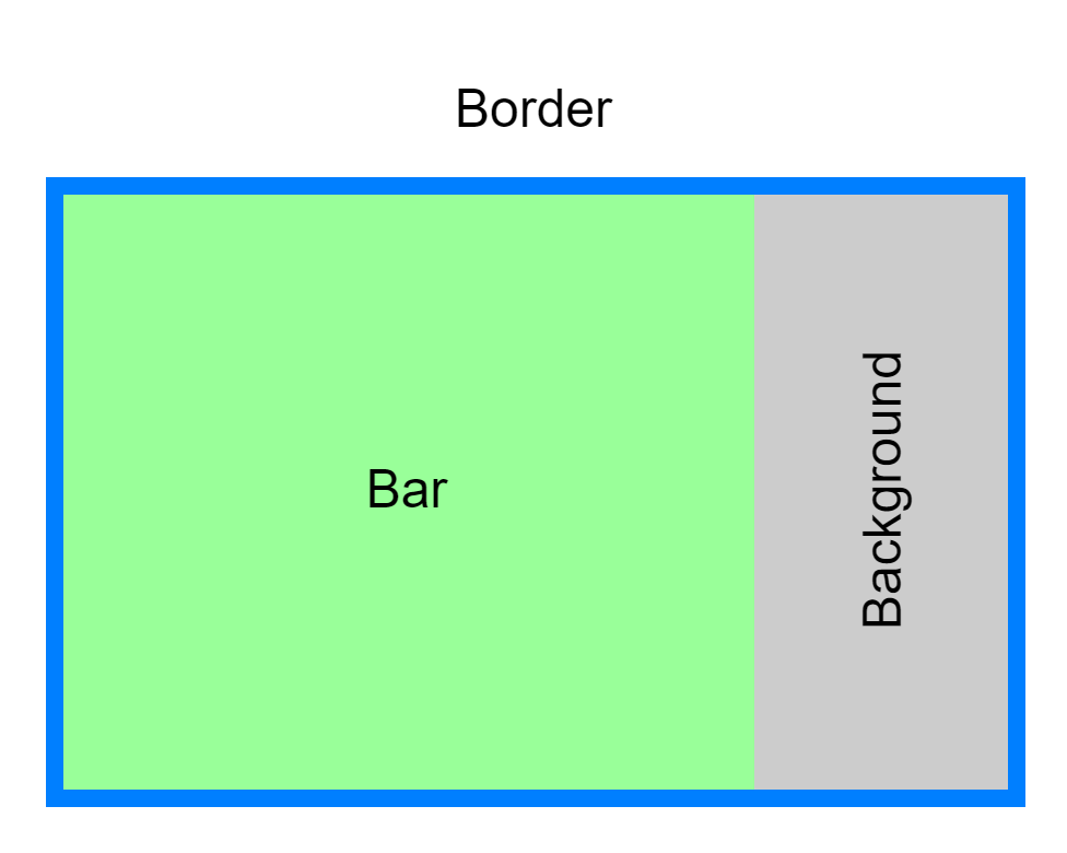
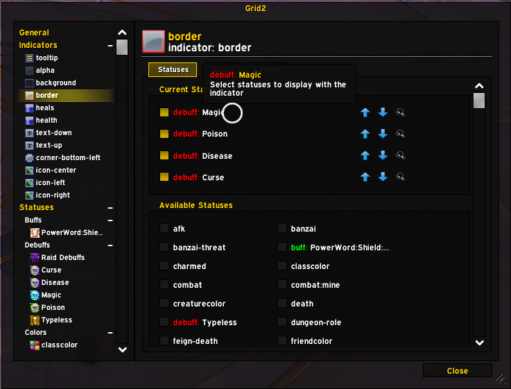
The Background is simply a color or texture that will be displayed behind the Bar when the Bar does not cover the entire frame, most likely because the player is not at full HP. You will notice that you cannot do much but change the color of the background indicator and assign it some status (which is rarely the right choice, since you will not see it when players are at full HP). Similarly, the Border provides some more configuration such as the texture or the border size, but is much more useful to display statuses already, as you can use the status color for the border color. A good example would be to display the color of a dispellable Debuff as displayed in the image below (blue for magic, green for poison etc). The only limitation is that you do not get text or an icon, just a color, avoid displaying too many things or use too similar colors between two statuses.
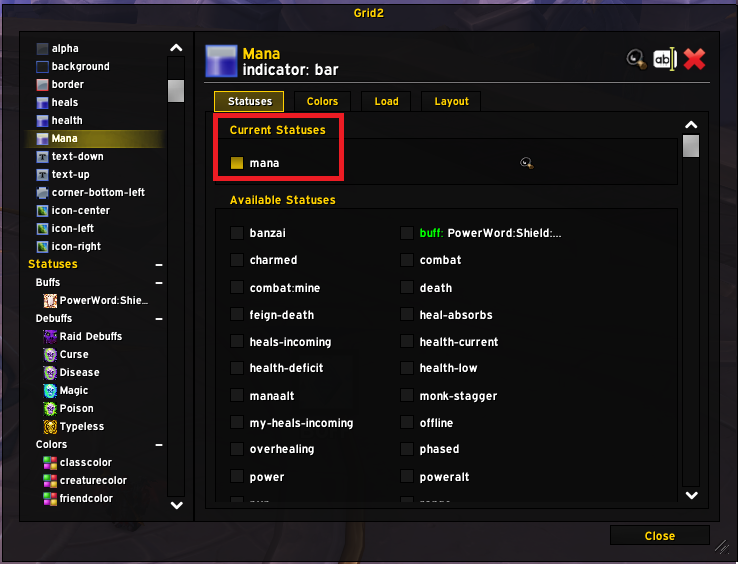
Finally the Bar is where the fun begins. A Bar is basically a rectangle which width will change to represent a value, for example your HP. There are two parts of a Bar that you can associate to statuses, its value (e.g. its size) and its colors. In the Statuses tab, you will select what to use for the size (for example health-current), and in the Colors tab, you will select what to use for the color of the bar (for example classcolor, or again, health-current if you prefer a gradient from red to green depending on the health level). You can create multiple bars, if for example you want to display the mana for the healers, you would create a new bar indicator in which you would assign Mana as the status (it will reduce as the mana goes down) and as the color mana as well (so it's blue :D).
What's left is to define how the bar is displayed. You can do anything here, but in general you may want to stay standard. If you want the bar to take the full frame at 100% value, the easiest is to set all X Offset, Y Offset Bar Width and Bar Height to 0, it will automatically "fill". If you want to display the Mana bar with 4 pixels of height at the bottom of the screen, simply choose BOTTOM as the Location and Align Point and change the Bar height to 4, while leaving the rest at 0.
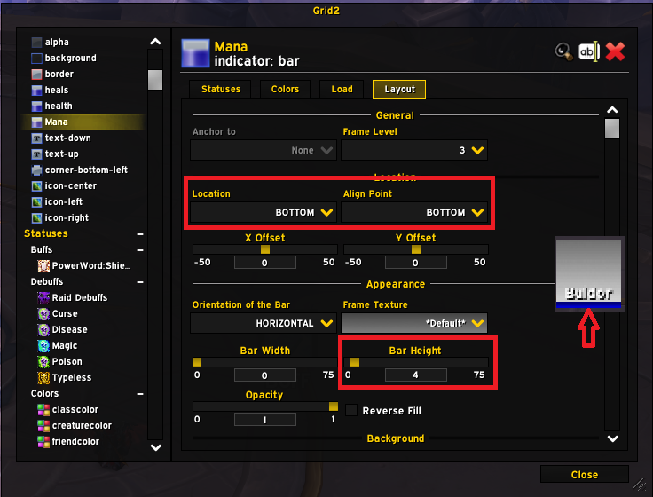
The option you might also be interested in is the Orientation of the Bar that you can choose to be horizontal or vertical depending on your preference. We will discuss the background and inversion options in Inverted bars, which leaves the display options Show Duration and Show Stacks. This is when you use a bar to display a buff. Imagine that you create a Bar indicator to display Atonement to have a a very visual way of knowing how much time there is left. You can select Atonement as the status to display (the bar will be displayed if the status is present) and the color to use whichever color you have set for the Atonement Buff. Here is what it looks like with show duration checked:

Multi Bar
There are other values you may want to display with bars that are based on your HP bar: Shields, Healing Absorbs, Incoming Heals namely. So you need a way to stack them on top of each other. You can achieve this by creating a new bar and anchoring it to your HP bar:
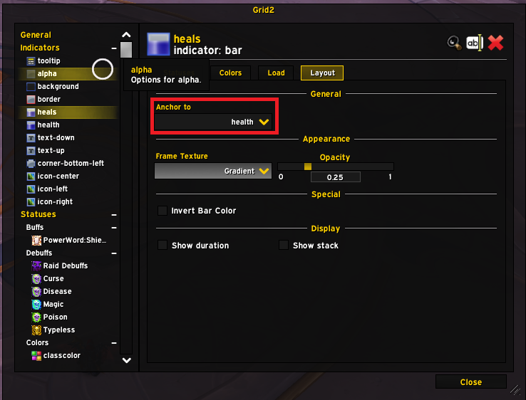
This works well, but you will have to create multiple indicators, and you will not be able to have "negative" values that will go "backwards" on the bar which will keep you from displaying healing absorbs in a practical way. The solution here is to use the multi-bar indicator. It has a lot of depth, but the best example is to create a complete health bar, for which you can follow our How to create a complete health bar (heal absorbs included) recipe!
Inverted Bars
Some of us prefer dark display, with bars that get colored to indicate that they are not empty. It does make sense as the status quo is for the bar to be filled. This is the sort of look we are talking about here:
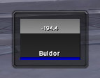
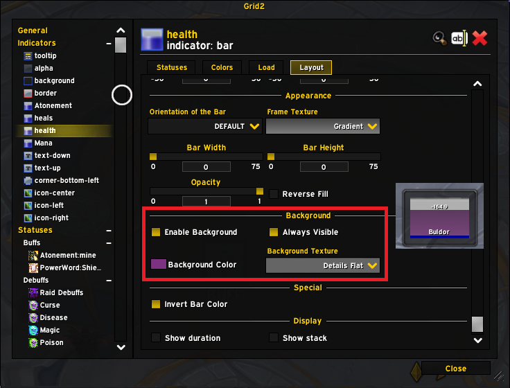
So how does it work? In Grid2, you will obtain this effect by inverting the bar and the background colors. You could do this manually, but it might be needlessly complex, or you can simply click invert bar color in the Layout Tab for the Bar.
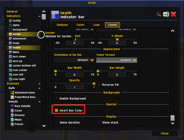
This will do it very simply and you are about done. If you use a multi-bar, you will have a similar "Invert" checkbox in the main bar options. The color that will be used is the color defined for the general background (see the Layout and Frames part). If you want however to setup the background color and texture for the bar, you can simply enable the background. Honestly, using a black background is fine though, you may want to tweak the opacity sometimes (in the color menu the A value).
Tooltip
There is not so much to say about the tooltip, you can use it to display some information, which can help for accessibility, or when you are trying out some new setup. Do not overthink it in general.
Icons
Now that we have covered bars in depth, we can move onto icons! No surprise here, we can display Buffs and Debuffs with their in game icons. Go to indicators to create a new indicator and select Icon as the type.
Use the Layout tab of the indicator to customize where it should be displayed and the size, border etc. In the status tab, you will be able to select with statuses you want to display there. Remember that a regular icon can only display one at a time, so if you select multiple statuses or if your status is a list type (buffs or debuffs), it will only display the first in the list. Here we display a simple icon on the right of the frame for Power Word: Shield
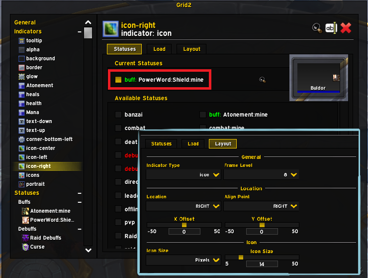
There are many options in the Layout tab on how to display your icon, including how to add some text for stacks, how to display a highlighted status, and how to display the cooldown wheel (or not) of the Buff/Debuff). Experiment here, there are plenty of cool options to achieve just the perfect display
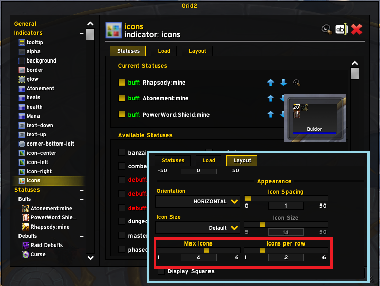
Now if you would like to create an area to display multiple icons at once, for your raid debuffs for example, you would need to create an icons indicator. Compared to a single icon, you will loose some layout options, but you keep the essentials, and it will let you give you some options to limit the number of icons and display them as a grid
Text
Frames also generally need some text, if anything to display the name of the player. You can use the text to display generic statuses, such as death, feign death, offline etc. In this case, it will be a static text that is displayed following these conditions.
There is a use case that I appreciate when it comes to tracking buffs however. Some specs rely on spreading a buff on multiple players, following the concept of a "ramp". These ramps will be stronger as there will be more players with the buff. It is good to have a very visual way to know how long the buff will remain on the players to know when they are about to expire etc. In this case, only using a text indicator to display the remaining duration can be very clear.
Let's take the example of my Disc Priest atonements. I want to display the remaining time of the atonement on each player in the top right corner like this:

So I need to have a buff status tracking atonement, and then I will need to create a text indicator. In the statuses to track, I will select my Atonement Buff Status, and then I will configure the layout like this:
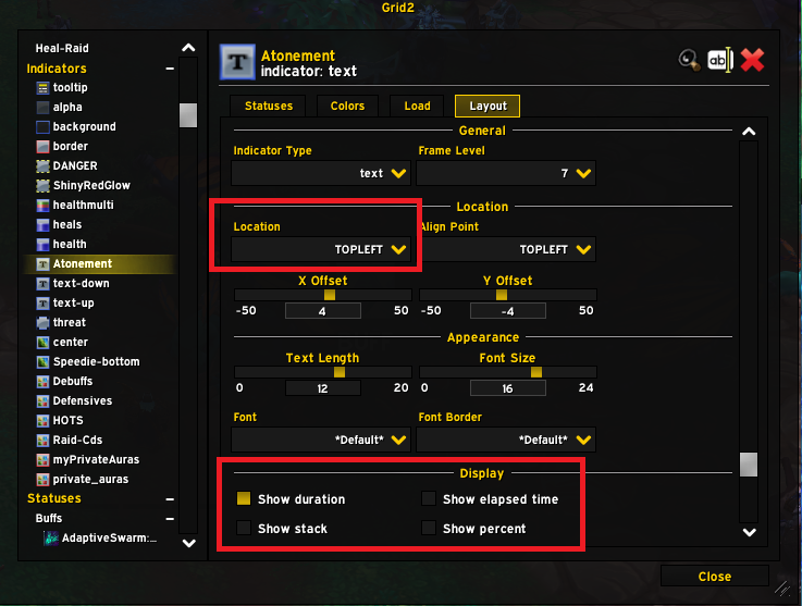
At this point, you have an indicator that shows the remaining duration as a countdown, great. But would it not be better if it turned red when there are less than 5 seconds remaining? It is possible! The first step we need to take is to go to the Colors tab for the indicator and select our Atonement status (same as in the status tab).
So know the color of the text will be linked to the color of our Atonement Buff Status. Let's go there now:
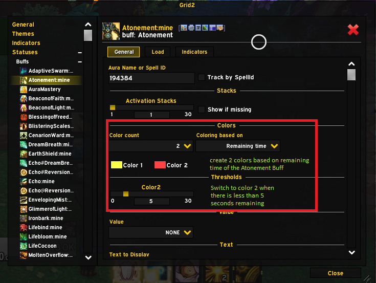
We can create 2 colors (or more!) based on the remaining duration, and then we can select the threshold at which we switch from one color to the other. So now, my text indicator, that is using this as the color, will turn red when there are less than 5 seconds remaining on the Atonement Buff!

Shapes and Glow
Grid2 also offers the possibility to creates shapes and glows to represent more statuses, that do not require details like the icon or the text. This will help you bring some additional information in a way that does not bloat your frames as much
Private Auras
Blizzard recently introduced Private Auras, which are a way to keep addons such as Weak Auras from tracking a debuffs and solve a problem for you. This is mostly a raid feature. Using this indicator will allow you to display these auras as icons somewhere on your frames. Check out How to display Private Auras on your frames
Portrait
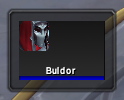
If you want to go fancy, you can even add a portrait to your frames, to display the class icon of the 2D/3D render of the characters. Simply create a Portrait indicator and position as you see fit.
Wire it up
Now that we have a buff status for Enveloping Mist and an icon indicator in the top left of our frames, what's left it link up the status and the indicator. There are tow mirrors ways to do this. You can get into the indicators tab of a status or in the statuses tab of an indicator. I know right?
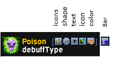
We already discussed how to select statuses to display from the indicator page, but you can also select indicators to use from the status page, in the same way, just check the box of the indicators you would like to use. One interesting thing to notice is that not all indicators can display all statuses, and Grid 2 lets you see which type of indicators are available for your buff.
Layout and Frames
We have discussed how to customize how the interior of your frames will look but we have not at all talked about what size they will be, where they will be displayed or how they will be arranged. Let's look into this now.
Cascade Settings
Layout and Frame Settings can be defined at different levels. In particular the Background of the frames can be defined in 4 different spots and it is important to understand how Grid2 will understand your settings. When it comes to Layout and Frames, Grid 2 will prioritize your theme settings over your general settings (see below about themes). When it comes to the background in particular, Grid2 will look at the settings defined in the bar settings if any first, then the Background Indicator or Theme settings (they are merged), then the General Settings for the Frame Background. In general it should not cause any issue, but if you modify a parameter and cannot see the effect, think about this behavior, that might very well be the reason.
Profiles and Themes
Like with most addons, you will want to tune your configuration depending on your class and specialization and share your configuration. Grid2 proposes two different tools to do just that: Themes and Profiles.
Profiles
Profiles are rather universal to WoW addons, and they basically allow you to write your entire configuration into a save file that you can access accross all characters in your account. You can also export them into a string that can be imported by anybody to be copied over. There is nothing very specific about Grid2. Profiles take a copy of everything in your Grid2 config, that's it.
Themes
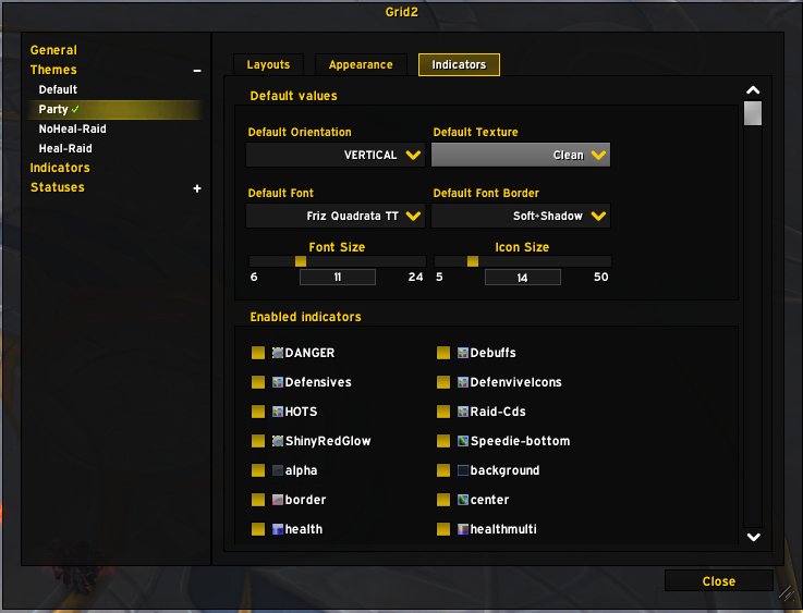
Themes are a lower level configuration tool (they are saved in the profile) and they allow you to create different layout configurations per class and specs. This is useful if you play the non-healing specs of your class as you will in general want your frames to be somewhat less central. The Themes page will allow you to define which them to use for which situation, depending on the spec you use, the type of groups you are in etc.
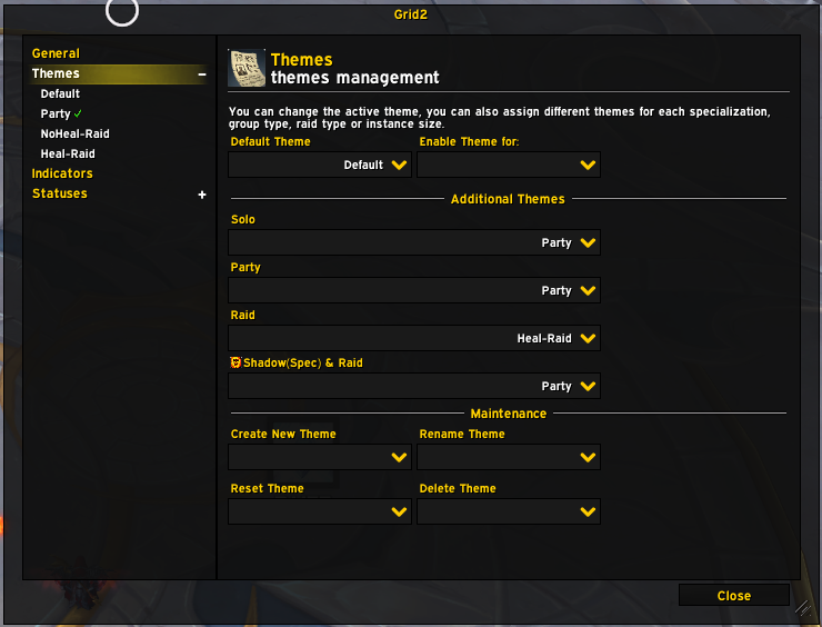
In a given Theme, you can overwrite the general configuration for Layout and Frames. This means that once you use Theme, you may need to look here when you want to modify these settings, as the General Configuration could be ignored. You can also choose which indicators you would like to display. This is particularly useful when you also raid, as you may want to see less information on the frames in raid, to reduce the clutter.
© 2023 Bubu
Thanks to Safio for the Icons - Tooltips are a courtesy of Wowhead